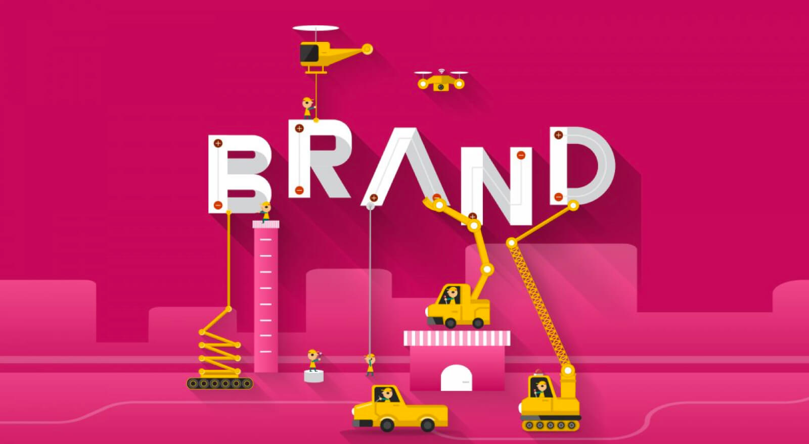
5 visual elements of a brand identity. As we often say, your brand is “all of the things.” It’s not just a logo, the colours that you design with or the website that your potential clients visit. It’s important to understand that branding goes beyond the visuals — it’s actually an emotional experience — and it’s what others think of you. It’s an expression of who you are, blended with what you do, where, when, why and how you do it — and all of the impressions that you make on people who come into contact with you. It’s how your potential clients experience you online and offline.
Although it’s a mix of your values, messaging, strategy AND design, it all really comes down to telling your story.
But, in order to visually tell your story well, you must have the proper and professional design elements in place. All of these individual elements work together to create a cohesive look and feel for your brand — and one that makes you look authentic and unique — and stand out from the crowd!
1. Logo: Your logo is the “face” of your brand — your major mark. The symbol that is unique just to you and that current and potential clients will come to recognize. It should be memorable and iconic — never too busy or detailed. It can be enclosed within a certain shape, its own free-standing design or illustration, or even just a simple type form (your business name spelled out in a strong font, with or without a smaller graphic element integrated with it.) If your business name has a tagline, you can even create two logo versions — one using the tagline and one without it. In addition to your primary logo, you can also create a secondary logo that is a smaller icon, monogram, etc. that you can use in place of the main logo for special occasions. It might consist of the same colors and a simple element or two from the primary version. We make sure that we provide your logo in various print + digital file formats (.eps, .pdf, .png, .jpeg are all sufficient) and in RGB and CMYK colour modes.
2. Typography: You should really have a collection of no more than 2-3 typefaces: a combination of a serif, a sans serif and a script. You can use a font from your logo, but you certainly don’t have to. It’s important to simply use fonts that complement your brand, are visually-pleasing and readable — most of all. Make sure that you have the proper fonts downloaded to all of your computer systems, so that they are used by you and/your entire team consistently. You can even use 1 or 2 fonts just for digital purposes (for your email + website copy, etc.) that are web-safe, if you’re afraid that the main font choices that you use for print platforms won’t translate well electronically.
3. Colour palette: While we suggest using no more than 2-3 typefaces in your visual branding, we do think that you can go a little “crazier” with the number of colours that you use AS LONG AS they all work well together. Feel free to piece together anywhere from 3-6 colors. Your palette should be representative of your brand’s personality and what will resonate well with your potential client base. Think about how different colors evoke different emotions. What do you want people to think and feel when they come into contact with your colors? And, don’t think that you just have to stop at 1. You can create a “primary” palette, which is the one that you use for your website, most collateral, is used within your logo, etc. But, you can also create a “secondary” palette that you use for smaller graphics, on social media, for special brand projects and more.
4. Imagery: It’s crucial to use photos that have the same look and feel, no matter what it is. Light and airy, moody or bold/ colourful are just a few examples. As long as they look similar and are used consistently, you are in good shape. You can use stock photos, but we really consider investing in some brand/lifestyle photos, so that you have a collection of images totally unique to you, that no one else will be able to use online. For example, our brand photos evoke the sense of white space, cleanliness and simplicity that we want our brand to express. In some photos, we even wear a purple top that is similar to the purple that we use in our brand colours. If we download free or purchased stock photos, we make sure that they also carry the same look and feel. You can even go to a craft store and purchase some office supplies/decor that is consistent with your brand and create flat lays to take your own photos for channels like Instagram, even if you’re not a photographer. A lot of small business owners do this! While photos are important to consider, you don’t necessarily have to use them, either. You can incorporate illustrations (hand-drawn, watercolour, sketches, etc.) to express yourself, services, products and more — just as effectively.
5. Supporting graphic elements: Once you have your logo and other elements established, think about incorporating secondary elements to really tie together your identity and pack an extra punch. These can include icons, shapes, patterns, textures and lines that are used to complement your brand — to pull out pertinent information, break up text and add additional dimensions to your designs.
If you wish to discuss how we can develop your brand or provide graphic design for your product or business? Contact us here and we will give you free advice and we should be able to find a service that works for you and your budget.


