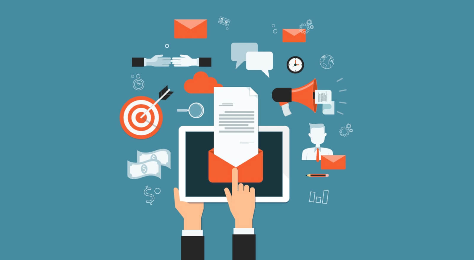
To help you start, we’ve created a list of 6 design tips to make your email newsletter visually appealing. Many businesses rely on email newsletters to build customer relationships and keep their companies top of mind with their audiences. A well-executed newsletter is a powerful email tool with multiple benefits, which is why it’s crucial to ensure your newsletter design is visually appealing. If it looks good, readers are more likely to click.
1. Create a header
No question, your newsletter needs a header. It’s the equivalent of a magazine, newspaper or website name. It sits at the very top of your newsletter and should include the newsletter title (if you have one), your company name and your logo.
Fortunately, there are online DIY tools to help you with your headers, such as Stencil or Pixlr. With these programs, you don’t need any graphic design experience to create and save graphics to your computer. Just create your header once, and use it again and again.
2. Let your logo dictate color scheme
Your newsletter needs a color scheme. Because your logo is part of your header, consider using its colors throughout your email newsletter as font colors, borders or other elements. After all, your logo’s colors should already be the color palette for your entire branding.
3. Stick to standard fonts
When selecting fonts for your newsletter, the top priority is legibility. Stick with basic fonts like Times New Roman, Helvetica or Arial. Refrain from using several different fonts in one newsletter: Too many fonts together gives a cluttered, disorganized look that can easily distract the reader. Pick one or, at the most, two fonts for your entire newsletter — and consider sticking with them for each newsletter you create.
4. Use subheadings
Your newsletter should have several different pieces of content that are broken up by subheadings. It should look a lot like a newspaper. The subheadings should be in one of the clear fonts that you selected. The size of the subheadings should be smaller than what’s used in your header, but larger than the text you use for articles.
5. Stack content
If you’re using a newsletter template through an email service provider like Mailchimp, you’ll be able to add content easily. For a layout that looks good to readers and scrolls smoothly on mobile devices, stack your content.
6. Use pictures
A well-designed email is a good balance of text and images. When a recipient opens your email, images instantly grab his or her attention. By adding a few pictures, you pull in your reader and enhance the effectiveness of your message at the same time.
When you create your next newsletter, add pictures that are easy to snap with your digital camera. For example, take a picture of an employee that you plan to highlight or grab a shot of your newest product to include in the next edition.
If you wish to discuss how we can develop an email newsletter or provide graphic design for your product or business? Contact us here and we will give you free advice and we should be able to find a service that works for you and your budget.
