We recently read an article online that talked about the psychology of colours. Colours that people seem to like over others depends on cultural roots and plain old personal preference. It’s an interesting thing (and sometimes difficult) — choosing the colours that fit your brand just right. The palette that you choose to put out into the world doesn’t necessarily have to be permanent, as branding always changes and evolves over time, but you need to make a good first impression to your potential audience — especially if you have gone through a rebrand and want to now be perceived differently or if you’re a new business that wants to draw in a slew of interested client prospects.
To put it simply, in any context or situation, colours stimulate emotion. They make people feel or think a certain way. They evoke memories and help to create experiences. Although fonts and colors aren’t the very first elements that a brand should be concerned with in beginning branding stages, they are significant when it comes to creating the visual identity and aspects, soon to follow, down the road. What do you want people to remember your brand for? Who is your ideal audience that you hope to reach and sell to? What kind of experience do you want that audience to have every time they come into contact with your brand? Colours will help with this overall experience and below, I’ve outlined (3) simple ways that you can choose the perfect mix of hues:
1) Think about the emotional experience that your audience will have.
Consider the demographics of your potential customer or client base. Are they young adults, baby boomers or older? Are they primarily male or female? What are their interests? Where do they live? What do they need from you and what you’re selling? A group of 35-55-year-old corporate males who live in suits and ties every day might enjoy a more professional and colder palette that includes blues and greys. But, 25-35-year-old mommy bloggers might appreciate something a bit warmer, inviting and cozy, like pastel pinks, oranges, ivories, and tans.
2) Start with 2-3 colors.
There are a lot of great colour combinations out there. Some seem to make perfect sense and others might appear to be a little wilder or bolder, but somehow, they still work. I have seen palettes that incorporate even 4-5 different colors and that can also be fine, but if you’re just starting out, I think that 2-3 is definitely plenty to play with. Choose a main, primary colour or two (purple and teal, for example) and then add a secondary color that can be used as an accent (like grey.) This accent colour can do just that — serve as an extra way to highlight certain parts of the text, create call-out boxes, pull out quotes and more.
3) Reference the color wheel — complementary and monochromatic colors pair well together.
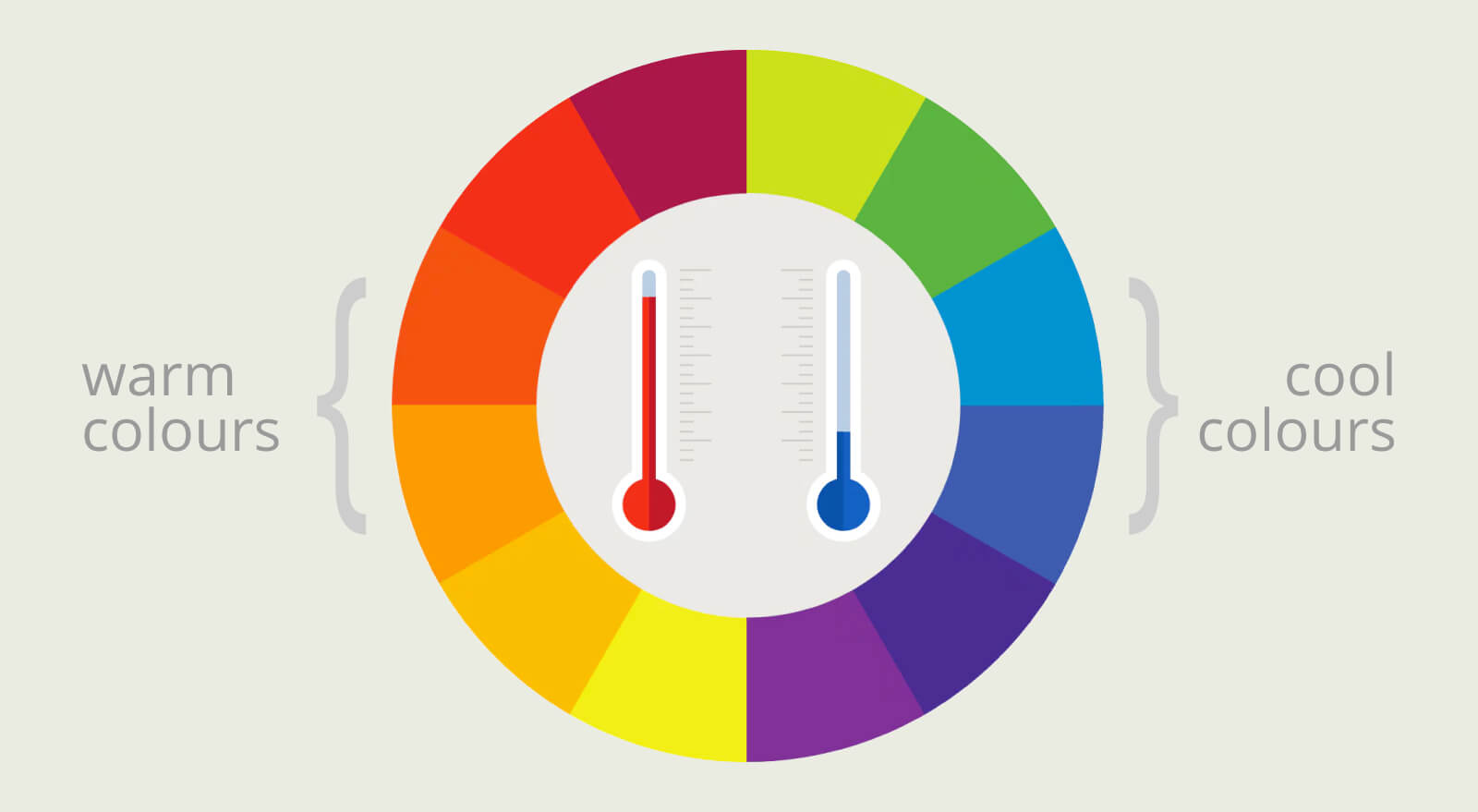
Even after you’ve considered your audience and know that 2-3 colours should be great to start with, you still might be clueless about actually choosing the exact colours. There are plenty of resources online that you can use to generate color palettes for you, like COLOURlovers, Coolors and Colllor. We also like to recommend pulling up the old-school colour wheel — that’s right, the one that you may not have seen since your school art class. In case you forgot, it’s basically a circle that represents the relationships between primary, secondary and tertiary colours. We’ve broken down what those are below:
Primary: red, yellow, blue
Secondary: orange, green, violet
Tertiary: yellow green, blue-green, blue violet, red violet, red orange, yellow-orange
The arrangement of these colours is originally connected with the wavelengths of light, as opposed to actual hues. It’s been around for literally centuries.
The reason why we recommend the colour wheel is because you can see what colours work well with others. A good rule of thumb is to choose complementary ones. These are the colours that are simply opposite of each other on the wheel. For example red-orange and blue-green match well together, just like blue-violet and yellow-orange. They’re usually bold and create good contrast. In an opposite way, monochromatic colours are the ones that fall next to each other, like red violet, violet, and blue-violet. They are varying shades of the same hue and a collection of 2-3 will always work well together in a visual identity.
Beyond just choosing the right colours, there are so many other important things to consider and nail down when it comes to branding. If you’re in need of some advice centered around this, give us a call on 07801 214657


